Understanding Colorful Weather Maps: What Do the Colors Really Mean?

If you’ve ever tuned into a weather broadcast or checked a weather app, you’ve likely seen vibrant, colorful maps. While they might look similar at first glance, these maps often represent very different types of information. Misunderstanding the purpose of these maps can lead to confusion. Let’s break down two common types:
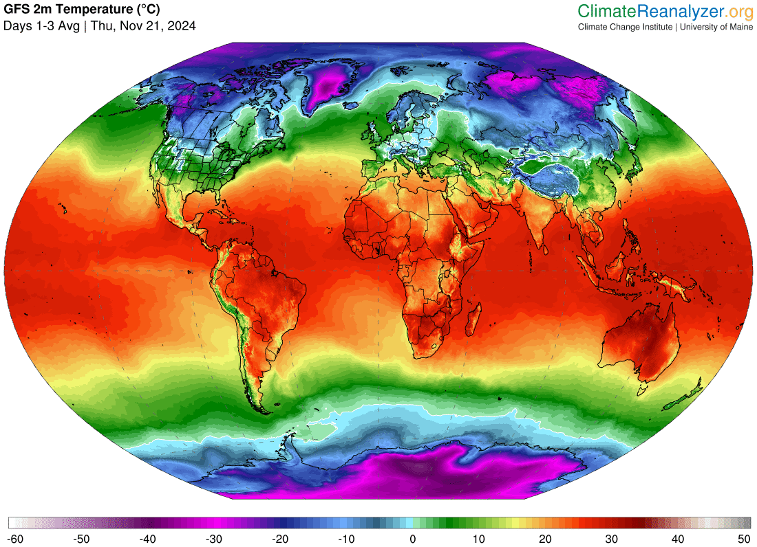
1. Temperature Maps
These maps display the current or forecasted temperatures across a region. The colors correspond to the actual temperature, with a gradient scale often ranging from cooler blues and greens to warmer yellows, oranges, and reds. For instance, on a Celsius-based map, orange typically represents temperatures of 30°C or higher, signaling a hot day.
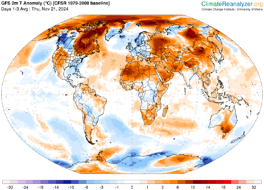
2. Temperature Anomaly Maps
These maps are designed to show temperature differences from the usual or average conditions for a particular time of year. Here, white areas indicate temperatures that are normal, while colors like orange and red signify warmer-than-average conditions, and blues represent cooler-than-average conditions. Importantly, orange doesn’t indicate a specific temperature here—it shows that the temperature is hotter than usual, regardless of what the actual temperature might be.
Why It Matters
Understanding the difference between these maps is crucial. A temperature map can help you dress for the day, while a temperature anomaly map gives insight into broader weather patterns, like heatwaves or unseasonal chills. The next time you see a colorful weather map, take a closer look at the legend—it’s the key to decoding the data!

This post is also available in: Spanish, Portuguese, French, Italian.


